20 Unsupervised Learning Methods
20.1 Introduction
Unsupervised learning techniques analyse data without predefined labels or outcomes, uncovering hidden patterns and structures. Unlike supervised learning (see Chapters 18 and 19), which predicts outcomes based on known (‘labelled’) data, unsupervised methods extract insights from unlabelled datasets.
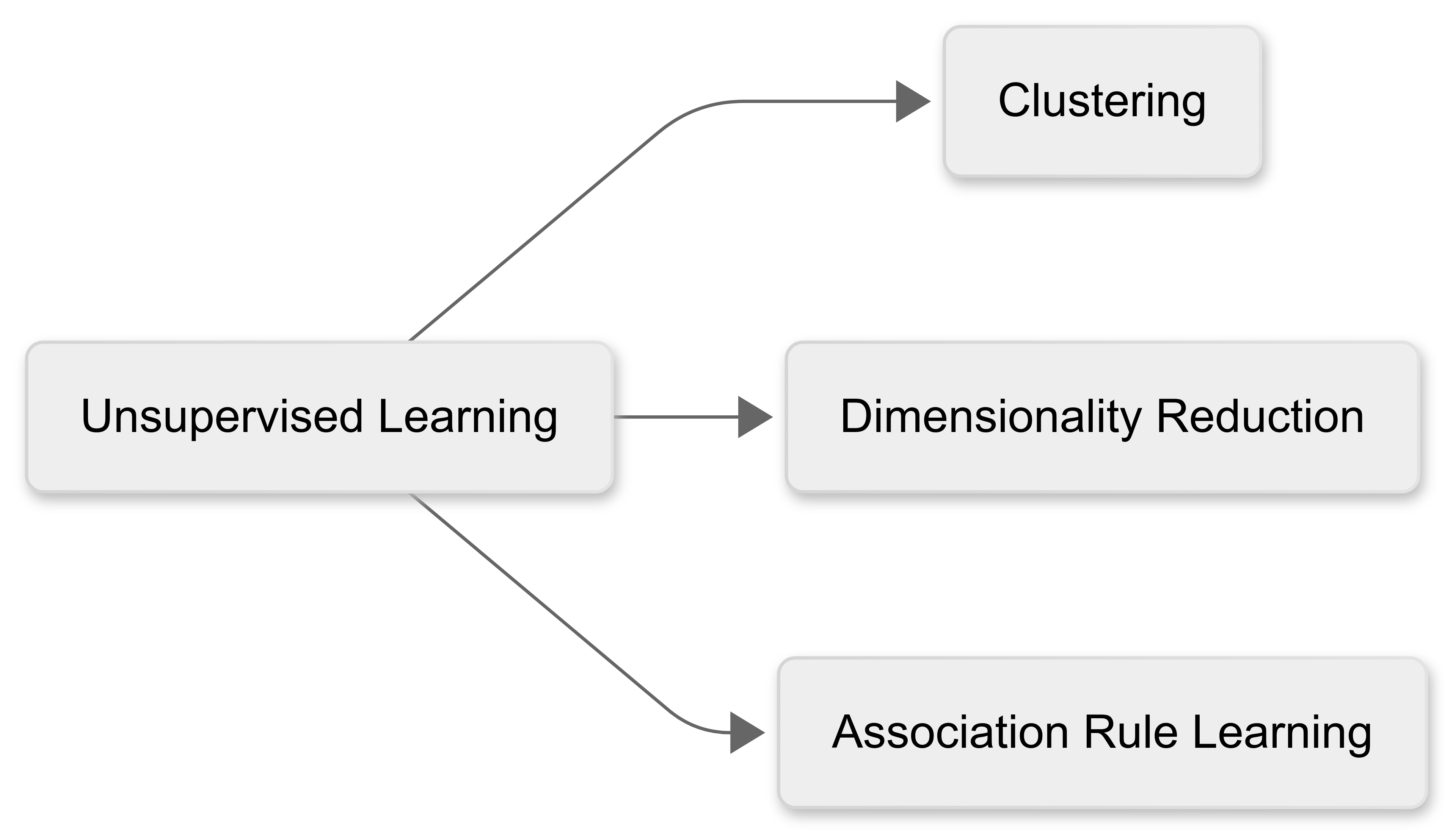
Common applications for unsupervised learning include:
Clustering: Grouping similar data points.
Dimensionality Reduction: Simplifying complex datasets.
Association Rule Learning: Identifying relationships between variables.
We’ll focus on these three applications in this chapter.
20.2 Clustering Techniques
20.2.1 What is clustering?
As noted earlier in the module, clustering is designed to group similar data points based on inherent characteristics.
Traditional clustering methods (like K-means) rely on predefined assumptions about the data, such as the the shape of the clusters.
Unsupervised learning offers more advanced techniques that adapt to complex, high-dimensional data, improving cluster accuracy and interpretability.
There are three main clustering models that are commonly used in unsupervised learning:
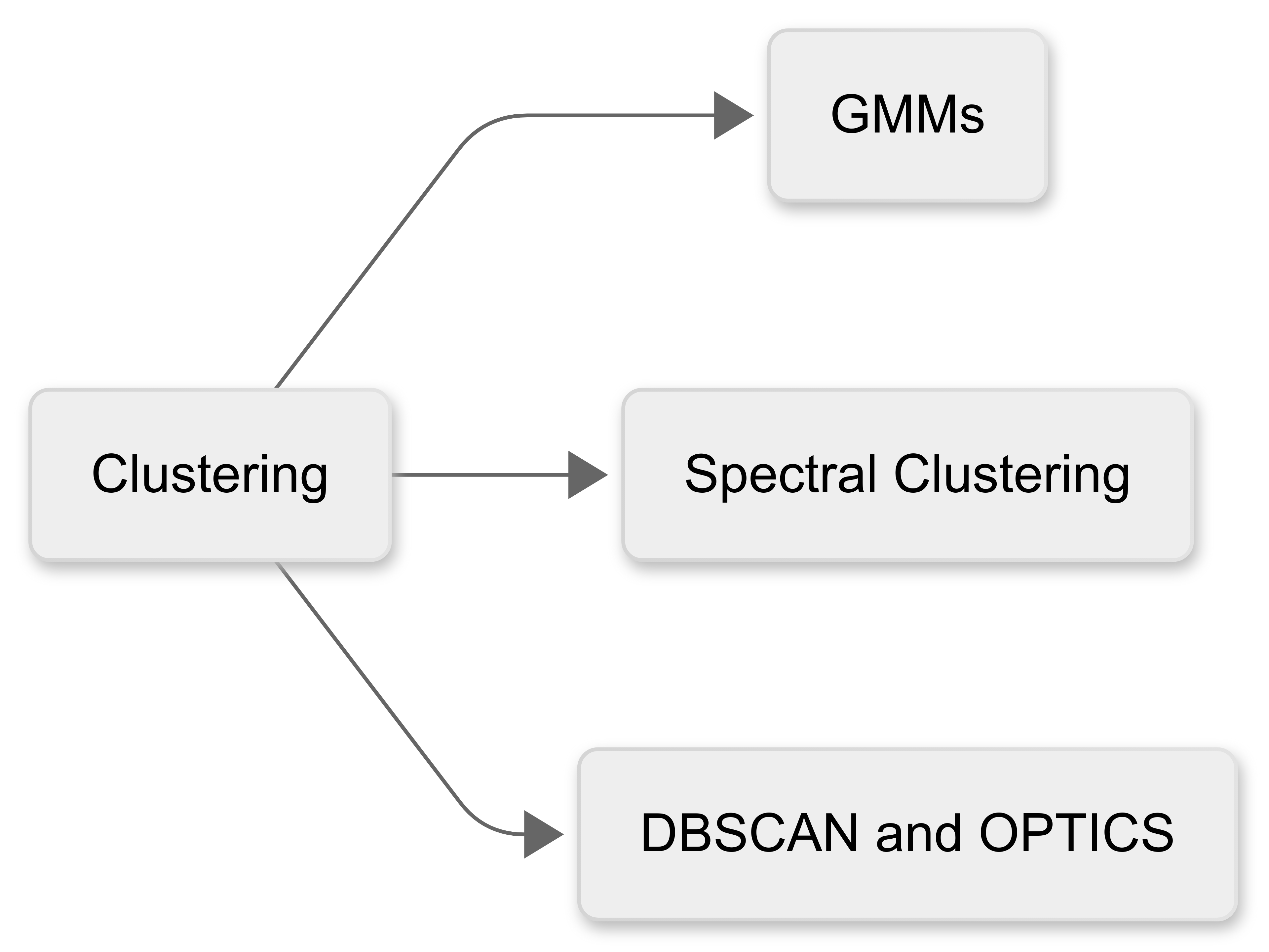
20.2.2 Gaussian Mixture Models (GMM)
Guassian Mixture Models assume that data originates from multiple Gaussian (normal) distributions, each with distinct characteristics.
Unlike K-means, which assigns each point to a single cluster, GMM provides a probabilistic classification, allowing data points to belong to multiple clusters with varying probabilities.
Here’s a visualisation of the Gaussian Mixture Model (GMM) in action.
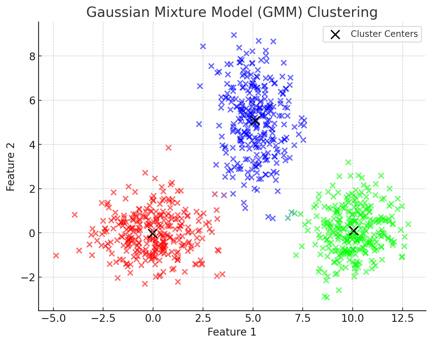
In this figure, the points represent data sampled from three underlying Gaussian distributions.
The black “X” markers indicate the estimated centers of the Gaussian distributions.
Unlike K-means, which would assign each point to a single cluster, the colour of each point here is blended based on its probability of belonging to different clusters. Notice that, for example, there are some points that are purple, indicating there is a strong probability that they are members of both the red and blue clusters.
How GMM works
GMM represents data as a mix of several Gaussian (normal) distributions, each with its own characteristics.
Using the Expectation-Maximisation (EM) Algorithm, GMM repeatedly adjusts its parameters (mean, variance, and covariance) to find the best fit for the data, increasing the likelihood of accurate modelling.
Instead of assigning each point to just one cluster, GMM gives each point a probability of belonging to multiple clusters, reflecting uncertainty and overlap. This is called soft clustering.
.png)
Advantages of GMM
GMM handles overlapping clusters well, as it assigns probabilities to each data point’s membership of the different clusters.
It’s more flexible than K-means, as it does not assume spherical clusters.
It provides probabilistic insights useful for decision-making; this is more subtle than simply allocating cluster membership on a yes/no basis.
GMM clustering could be useful in a wide variety of situations. For example:
To identify subgroups in athlete physiological data, such as heart rate variability, where overlapping groups exist.
To classifying player movement patterns without predefined categories, which may lead to new insights.
20.2.3 Spectral Clustering
A second approach to clustering, called Spectral clustering, uses similarity matrices and eigenvectors to partition data. Unlike traditional methods, it captures complex relationships, making it ideal for networked data (like football passing patterns).
For example, it could help identify strategic subgroups within teams that operate as cohesive units.
The following visualisation demonstrates Spectral Clustering applied to football passing patterns:
.png)
In this figure:
Each dot represents a player positioned on the field.
Colours indicate different tactical subgroups detected using spectral clustering.
Lines represent strong passing relationships between players, based on their positional similarity (closer players are more likely to pass frequently).
Unlike traditional clustering methods, spectral clustering captures complex relationships by analysing the network structure rather than just distance.
How Spectral Clustering Works
Data points are treated as nodes, and edges represent similarities.
Laplacian Matrix Calculation is used to construct a matrix based on the similarity between nodes.
By analysing the eigenvectors of this matrix, data is projected into a lower-dimensional space where clustering becomes easier
Finally, standard clustering methods (like K-means) are then applied in this transformed space.
Advantages of Spectral Clustering
Spectral Clustering has some significant advantages:
It works well with non-convex and complex structures.
It doesn’t impose assumptions about cluster shapes.
It’s useful for graph-based datasets and social networks.
In a sporting context, spectral clustering could be used to:
Analyse passing networks in team sport (e.g., football, basketball) to identify key player groupings.
Detect formations and strategic subgroups within teams.
20.2.4 DBSCAN and OPTICS
Finally, density-based methods like DBSCAN (Density-Based Spatial Clustering of Applications with Noise) and OPTICS identify clusters based on data density rather than relying purely on distances between data points.
These approaches are particularly effective in:
Identifying arbitrarily shaped clusters, including irregular or elongated patterns that traditional clustering algorithms, like k-means, often miss.
Handling noise and outliers effectively by classifying points in low-density regions as noise, ensuring robustness even when data includes irrelevant or anomalous points.
Detecting clusters without needing prior knowledge of the number of clusters, making them highly flexible and suitable for exploratory data analysis.
How DBSCAN Works
DBSCAN identifies clusters based on the density of data points within a given region. Unlike traditional methods, which group points based on simple distance measures, DBSCAN uses local density to define clusters, enabling it to detect more ‘natural’ groupings.
DBSCAN identifies clusters by assessing the density of points in neighborhoods. A region is considered dense if a sufficient number of points lie within a specified radius (ε). Regions with high density become clusters, while regions with low density represent boundaries or noise.
Core, Border, and Noise Points
In DBSCAN, core points are data points at the heart of clusters, having at least a minimum number (minPts) of neighbouring points within a given radius (ε).
Border points are located on the outskirts of a cluster, close to core points, but themselves having fewer than minPts neighbors within the radius. They belong to clusters but don’t form clusters themselves.
Noise points do not meet the criteria for core or border points. DBSCAN treats these as outliers, effectively excluding them from clusters.
This figure demonstrates this idea of ‘core’ and ‘border’ points. The core points for each cluster are in dark blue, and the border points are in light blue.
.png)
Here’s a comparison of a DBSCAN cluster model, compared with a more conventional k-means model:
-01.png)
No predefined number of clusters
Like GMMs and Spectral clustering, DBSCAN is an unsupervised learning model. It organically detects clusters without requiring prior specification of the number of clusters. This flexibility makes it especially useful for exploratory data analysis.
Advantages of DBSCAN
DBSCAN has a number of advantages over the other approaches we’ve covered:
It can discover arbitrarily shaped clusters.
It’s been shown to be robust to noise and outliers.
There’s no need to specify the number of clusters beforehand.
How OPTICS improves DBSCAN
OPTICS (Ordering Points To Identify the Clustering Structure) improves upon DBSCAN by using a hierarchical clustering approach, where points are ordered based on their density relationships rather than grouped directly. This allows for the detection of clusters at multiple scales without predefining density thresholds.
A key feature of OPTICS is the reachability plot (a visual representation of the clustering structure) that helps us intuitively identify the optimal cluster configuration.
Here’s an example:
.png)
OPTICS enhances DBSCAN by providing flexibility and clarity, particularly if we’re dealing with datasets containing clusters of varying densities or complex, nested groupings.
20.2.5 Validating clusters
All three of these models are unsupervised machine learning, and therefore lack predefined labels against which to test the model. Therefore, model validation is essential to help us assess the quality and performance of our model.
Metrics used to do this include:
Silhouette Score: This measures cluster compactness - the more compact, the better.
Davies-Bouldin Index: This assesses cluster separation - the more separation, the better.
Domain-Specific Comparisons: This cross-checks results with subject knowledge (for example, coaching insights) to enhance reliability.
These were covered in Chapter 4, so you may wish to revise that material before proceeding to the next section.
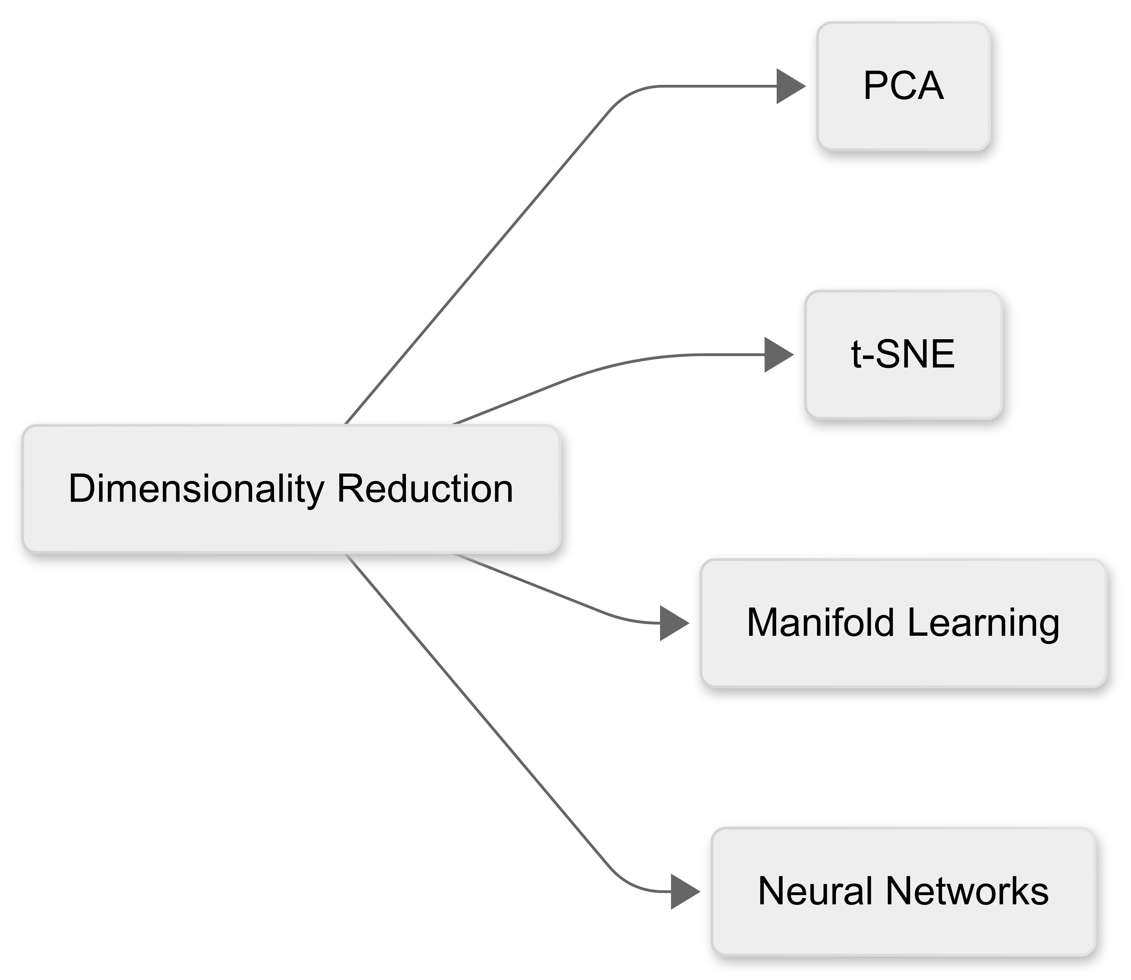
20.3 Dimensionality Reduction
“Dimensionality reduction” is the process of transforming high-dimensional data into a lower-dimensional space while preserving important patterns and structures.
This helps improve computational efficiency, reduce noise, and enhance visualisation. Commonly-using techniques include PCA (Principal Component Analysis), t-SNE (t-Distributed Stochastic Neighbor Embedding), Manifold Learning and Neural Networks.
20.3.1 Principal Component Analysis (PCA)
The first approach to dimensionality reduction we’ll consider is Principal Components Analysis (PCA). PCA is still commonly used, though technically it is not a machine learning technique.
Basically, PCA projects data onto new axes (principal components) that capture maximum variance.
In sport, it’s useful for:
Summarising player statistics;
Identifying key performance factors; and
Simplifying motion capture data.
Here’s a visualisation to help illustrate PCA in the context of player statistics:
.png)
Left Plot: Original Data (Before PCA)
Represents player statistics in a three-dimensional space (e.g., speed, accuracy, endurance).
Shows how different features exist in their raw form, with overlap and redundancy.
Right Plot: PCA-Transformed Data (After Dimensionality Reduction)
Data is now projected onto two new axes (Principal Component 1 & 2), capturing the most variance.
This reduces complexity while retaining key patterns, helping in summarising performance factors or simplifying large datasets
This demonstrates how PCA can be useful in extracting meaningful insights from high-dimensional sports data while reducing noise and redundancy.
20.3.2 t-Distributed Stochastic Neighbor Embedding (t-SNE)
A second approach to dimensionality reduction is t-Distributed Stochastic Neighbor Embedding (t-SNE).
t-SNE is computationally intensive, and analysis using this method can take some time to complete, depending on the performance of your hardware.
Unlike PCA, which focuses on preserving global variance, t-SNE prioritises local structures, making it particularly effective for uncovering hidden patterns in high-dimensional datasets.
In sport, t-SNE could be especially useful for:
Visualising clusters of similar players: By mapping high-dimensional player statistics into a two-dimensional space, t-SNE could help identify natural groupings based on playing style or performance metrics.
Identifying tactical subgroups: Coaches and analysts could use t-SNE to explore how their players fit into different strategic roles, such as offensive vs. defensive positioning in a team.
Differentiating physiological profiles: In sports science, t-SNE could assist in distinguishing physiological characteristics (such as endurance-focused vs. power-focused athletes) based on fitness data.
Unlike PCA, which produces a linear transformation, t-SNE is a non-linear technique, meaning it excels at uncovering complex, non-obvious relationships between data points.
However, it’s computationally expensive and doesn’t explicitly define feature importance. This makes it best suited for exploratory data analysis and visualisation rather than predictive modeling.
t-SNE example
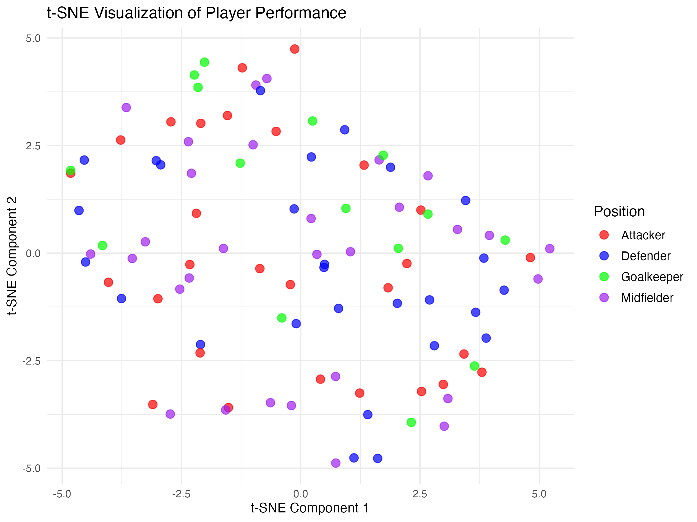
In this example, player data (e.g., speed, endurance, agility, passing accuracy, etc.) and t-SNE has been used to reveal distinct groups of players with similar characteristics.
Players are colour-coded based on predefined clusters, showing how t-SNE naturally finds subgroups within the data.
20.3.3 Manifold Learning
Manifold learning methods like ISOMAP and Locally Linear Embedding (LLE) help uncover non-linear patterns in high-dimensional data, making them valuable for analysing complex datasets.
Unlike PCA, which assumes linearity, these techniques focus on preserving important structures within the data.
Key Manifold Learning Methods: ISOMAP (Isometric Mapping)
ISOMAP focuses on preserving global structure by maintaining the shortest path distances between data points.
In sport, it could be useful for tracking athlete movement trajectories such as mapping running styles or analysing player positioning over time.
LLE (Locally Linear Embedding)
LLE prioritises local relationships, ensuring that small neighborhoods of data remain consistent.
In sport, it could be ideal for biomechanical analysis, such as studying joint motion and movement patterns in sports science.
To clarify these concepts, here are two visualisations that demonstrate ISOMAP vs. LLE in the context of athlete movement analysis::
.png)
Left Plot – ISOMAP (Preserving Global Structure)
- Notice that ISOMAP maintains the overall structure of the data, ensuring that distances between far-apart points remain meaningful.
Right Plot – LLE (Preserving Local Structure)
- Notice that LLE focuses on maintaining local relationships, meaning nearby points stay close together, even if the global shape changes.
20.3.4 Autoencoders (Neural Network-Based Reduction)
Autoencoders are another approach to dimensionality reduction. They use neural networks to compress and reconstruct data, identifying hidden patterns.
Imagine you have a magical “shrinking machine” and a “growing machine”.
The ‘Shrinking Machine’ is called the Encoder: This part takes a big picture (your data) and tries to make it really small, like folding a big paper to fit into a tiny box.
The ‘Growing Machine’ is called the Decoder. After the encoder has done its job, the decoder unfolds or “grows” the picture back to its original size, trying to make it look the same as before.
Over time, this two-part machine (called an autoencoder) gets better at finding the most important parts of the picture that really matter. By focusing on those important parts, it’s able to shrink the data in a way that lets it rebuild them later as clearly as possible.
This shrinking helps us understand and work with only the most useful information in the data.
Example
Figure One: Scatterplot of digits (0 to 9)
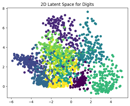
This scatter plot shows the compressed representation of each digit image in a 2D space.
Each point represents an image of a handwritten digit (from 0 to 9), and its position is determined by the autoencoder’s encoder output (the latent space).
The colors represent different digit labels, allowing you to see how well the autoencoder has learned to separate different digits in this reduced space.
Ideally, similar digits (e.g., all ’0’s, all ’1’s) should cluster together, indicating that the autoencoder has successfully captured meaningful features.
Figure 2: Original Digit
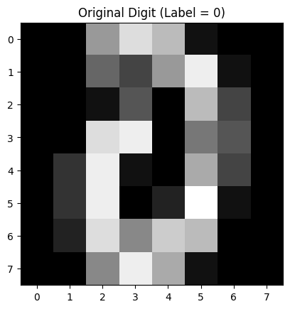
This grayscale image is a randomly selected original handwritten digit from the dataset.
It’s an 8×8 pixel image where each pixel’s brightness represents the intensity of the stroke (darker means more ink).
This is the input that was given to the autoencoder.
Figure 3: Reconstructed Digit
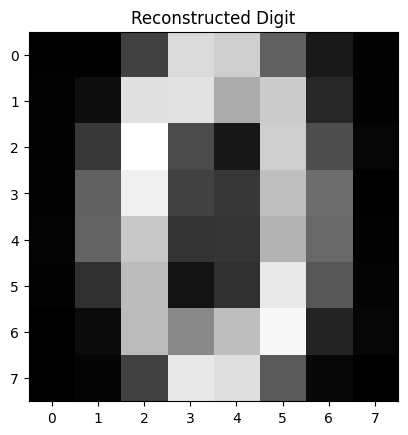
This image is the reconstruction of the original digit after being compressed and then expanded by the autoencoder.
The autoencoder takes the input digit, reduces it to just two numbers (from the latent space), and then tries to reconstruct it back into an 8×8 image.
If the autoencoder is working well, this reconstruction should closely resemble the original digit.
Blurriness or distortions suggest that the model may need more training or a more complex architecture.
20.4 Association Rule Learning
In the final section of the chapter we’ll review Association Rule Learning, another form of unsupervised machine learning.
20.4.1 What is Association Rule Learning?
Association Rule Learning is a machine learning technique used to identify patterns and relationships between variables in large datasets. It’s widely applied in areas such as market basket analysis, recommendation systems, and fraud detection, where understanding the likelihood of items or events appearing together is valuable.
The core idea behind association rule learning is to generate rules that describe how certain variables are related. A rule is typically represented as A → B, meaning that if A occurs, then B is likely to occur as well.
For example, in retail analysis, a common rule might be “If a customer buys bread, they are likely to also buy butter.”
This kind of insight allows businesses to optimise product placements, cross-selling strategies, and targeted promotions.
20.4.2 Metrics
To measure the strength and reliability of these associations, three key metrics are used: support, confidence, and lift.
Support refers to how frequently items appear together in the dataset, calculated as the proportion of transactions containing both A and B.
Confidence measures the likelihood that B occurs given A, indicating how often the rule holds true.
Lift evaluates how much more likely B is to occur when A is present, compared to its independent occurrence. A lift value greater than 1 suggests a positive correlation, while a value close to 1 indicates little to no association.
By analysing large datasets with association rule learning, we can extract meaningful patterns that would otherwise go unnoticed.
20.4.3 Example
Here’s an example of how Association Rule Learning could be applied to a football dataset:
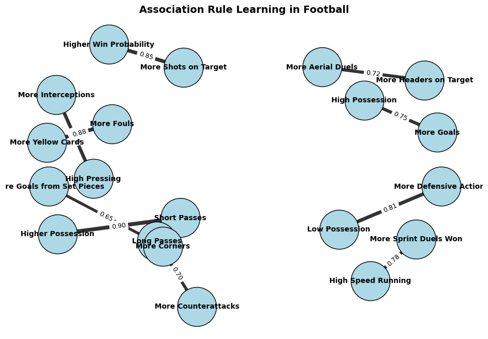
You can see that this graph helps visualise relationships in football analytics, such as how pressing leads to interceptions, possession influences goal-scoring, or fouls correlate with yellow cards.
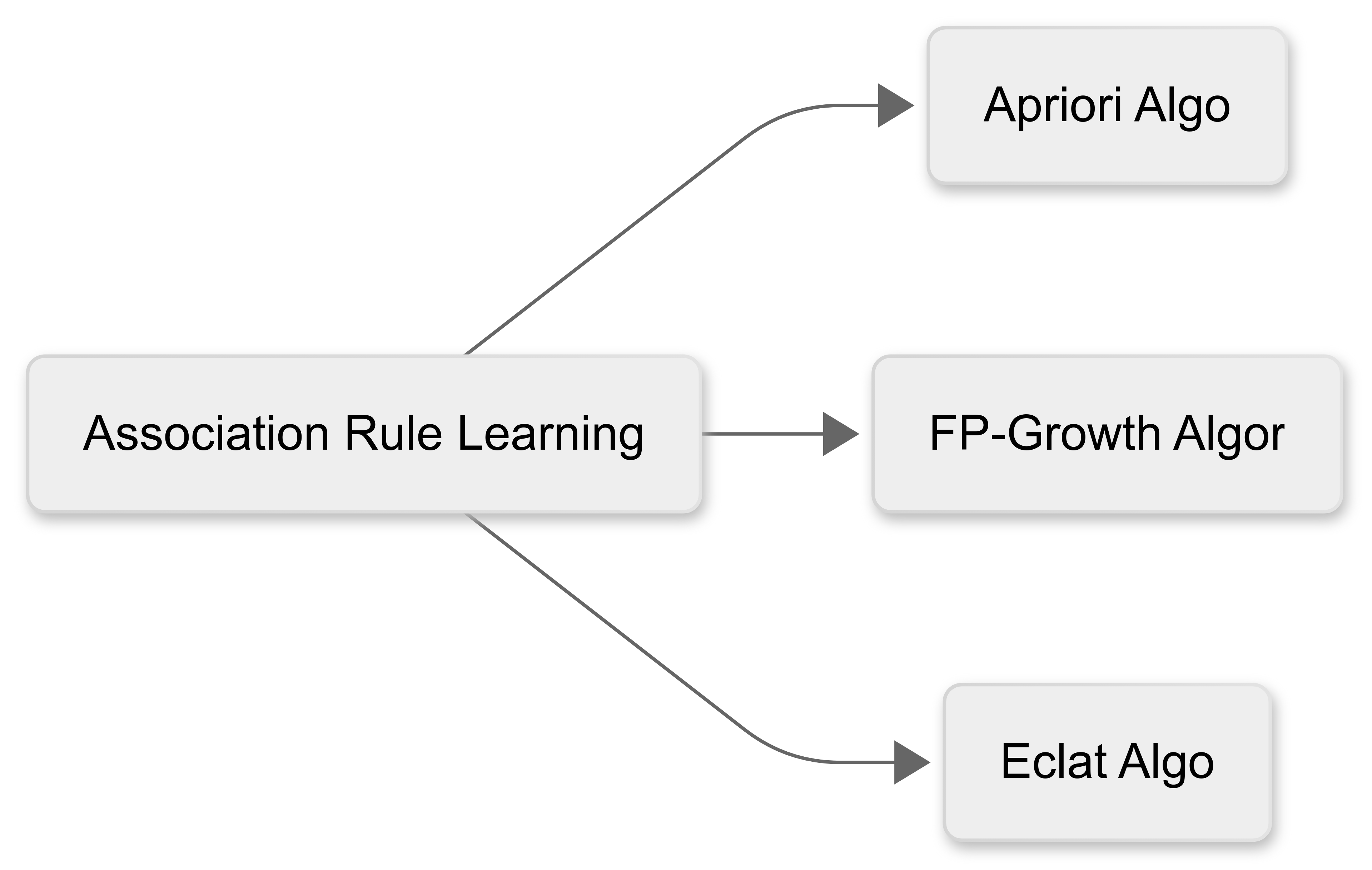
20.4.4 Algorithms
Association Rule Learning uses a number of different algorithms to detect the relationships (associations) between items in the dataset:
Apriori Algorithm - This uses a breadth-first approach to iteratively extend frequent itemsets. It prunes unpromising candidates but requires multiple database scans, making it less efficient for large datasets.
FP-Growth Algorithm - This builds a Frequent Pattern tree (FP-tree) to compress data, reducing redundant storage. This improves efficiency over Apriori but can struggle with large FP-trees.
Eclat Algorithm - This uses a depth-first search and stores itemsets as transaction IDs (tidsets), making it highly efficient for dense datasets, but memory-intensive.
20.4.5 Usefulness in sport data analytics
Association Rule Learning could be highly useful in sport data analytics. For example:
We could use association rules to understand how different events or strategies influence match outcomes. For example, an association rule might reveal that “Teams that complete more than 70% of their passes in the final third are 60% more likely to score a goal within the next five minutes.” This might help teams refine their attacking play, identify effective passing patterns, and adjust their strategies in real time.
By analysing training loads, match participation, and medical records, association rule learning could uncover relationships between player workload and injury risk. For instance, a rule might indicate that “Players who cover more than 11 km per match with three or more high-intensity sprints have a 40% increased risk of hamstring injuries.” This could help medical staff design better recovery plans and adjust training intensity to minimise injuries.
We could identify key attributes that correlate with success in different playing positions. For example, “Midfielders who make at least 50 progressive passes per season have a 70% chance of contributing to 10 or more assists.” These insights could help clubs identify promising talent and make data-driven decisions in player acquisitions.
We could analyse historical match data to discover patterns in an opponent’s playing style. A rule such as “Teams that concede more than five corners per match are twice as likely to concede a goal from a set-piece.” might help a team tailor attacking set-piece strategies against specific opponents.